Data Visualization with Big Data
Why visualize?
- We’ve already seen that visualizations are an important data analysis tool (Loftus)
- Visualization for analysis vs. visualization for communication:
- “Reveal relationships in large datasets…”
- “…and communicate information to a broad audience”
- Not necessarily the same thing!
Reveal relationships
… in large datasets?
![]()
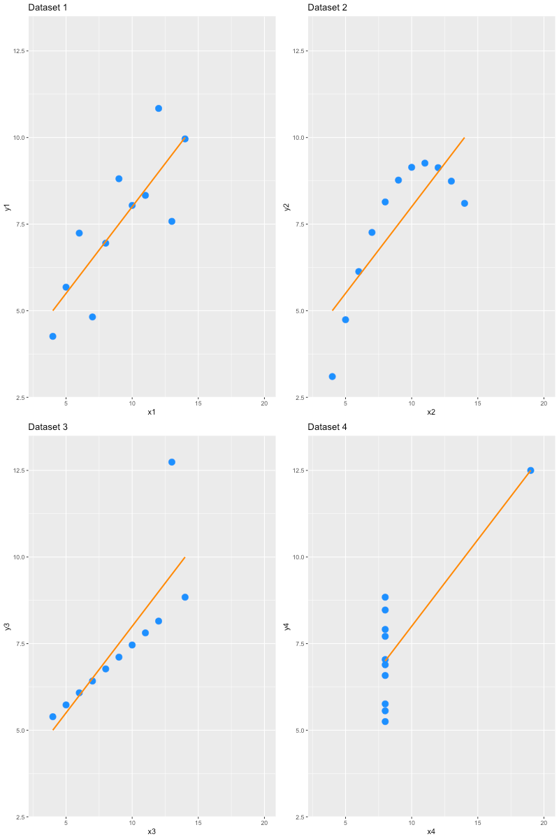
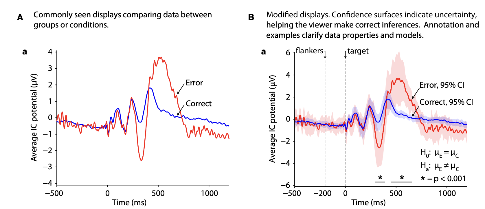
A few basic items
From Allen et al. (2012)
- Are the axes labeled?
- Are scales and units indicated?
- Is there a measure of uncertainty (e.g., error bars)?
- Is the type of uncertainty (e.g., SEM, CI, …) indicated?
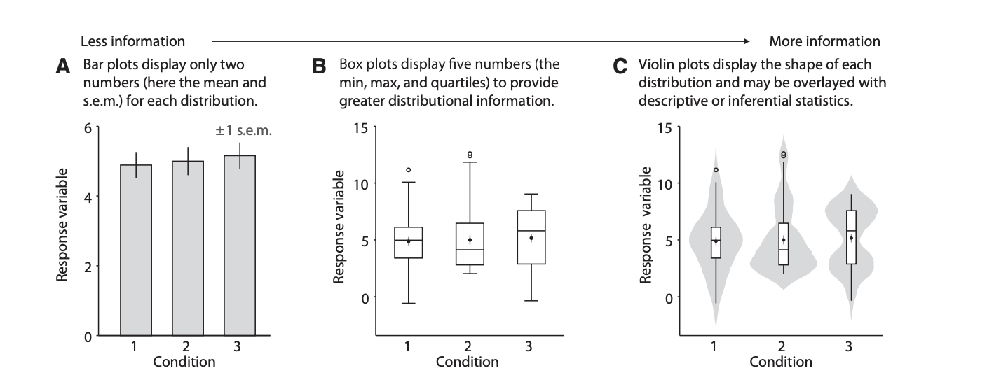
Show more, hide less
- From bar plots …
- … to box plots …
- … to swarm plots, violin plots, …
Show more, hide less
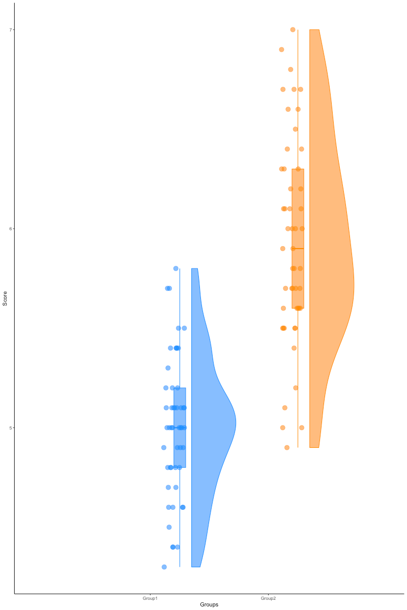
![]()
…raincloud plots
![]()
See https://github.com/jorvlan/raincloudplots
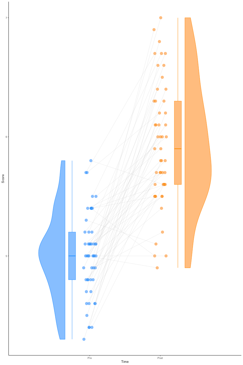
Even with repeated measures
![]()
See https://github.com/jorvlan/raincloudplots
Using color
- Think about accessibility
- About 5-8% of males + 0.5-1% of females cannot distinguish certain shades of red and green
- Color is itself multidimensional
- Can use hue and saturation/transparency independently
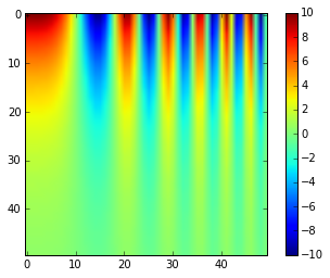
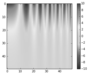
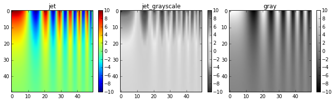
- Using the right colormap matters
- Color maps: each number maps to a color
- Avoid colormaps that are not perceptually uniform
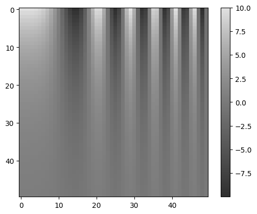
Solutions?
- Use grayscale
- Use a colormap that is optimized for perceptual uniformity
- Viridis
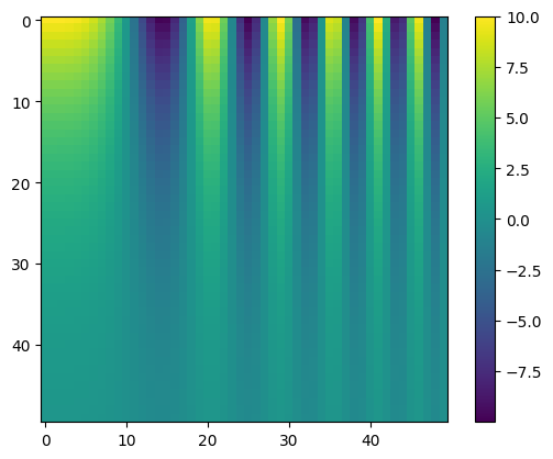
Viridis
![]()
Viridis
![]()
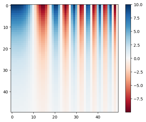
If you need a divergent colormap
![]()
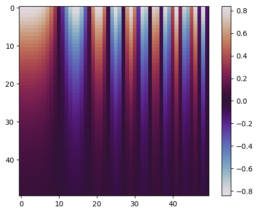
Or a circular colormap
![]()
Aligning graphics and concepts
Based on Goldstone et al. (2015)
- Continuous dimensions with continuously perceived graphical attributes:
- Saturation
- Size
- Position along an axis
- Categorical dimensions with categorically perceived graphical attributes:
- If using time (e.g., in animation) match that with time in the experiment.
- If that’s a relevant dimension.
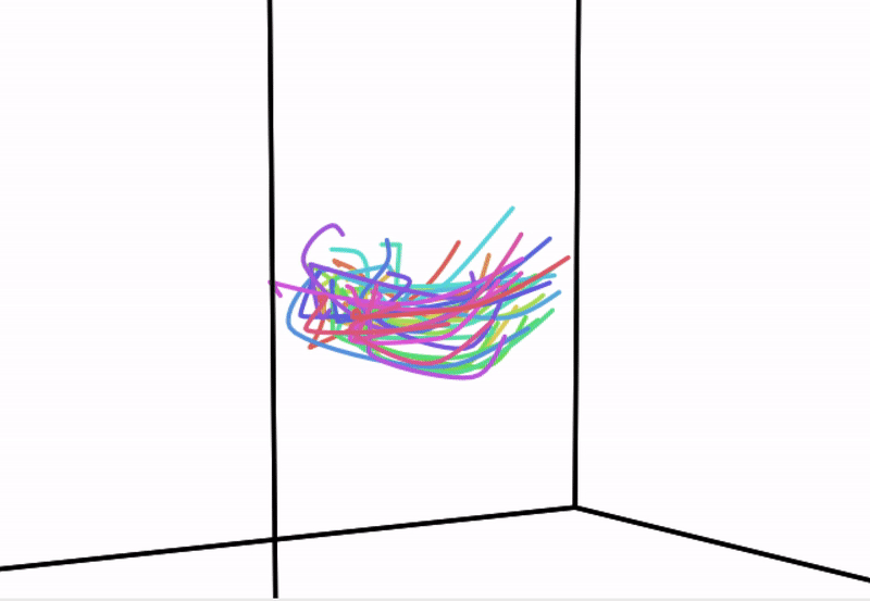
So, have we solved the curse of dimensionality?
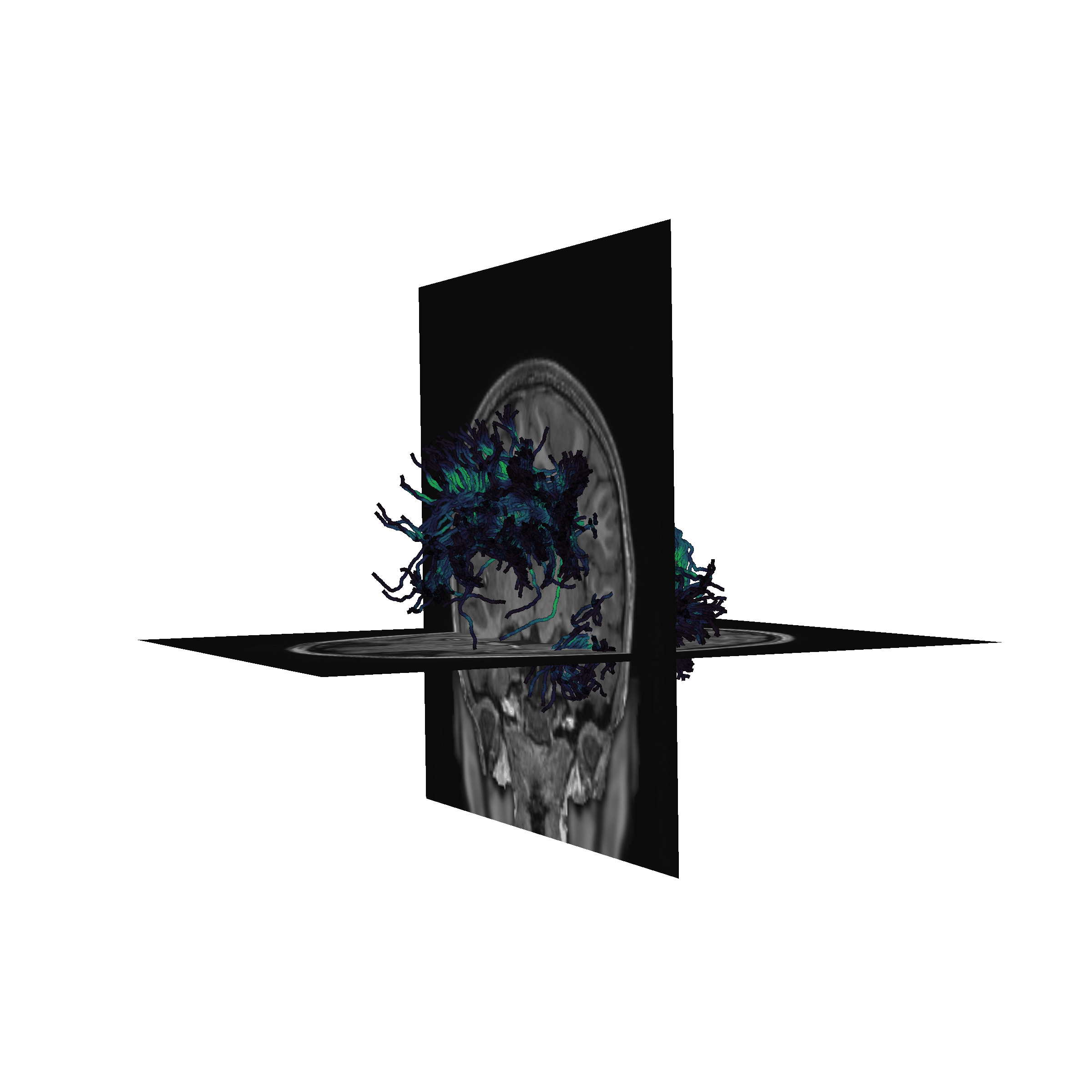
Using animations
Can help with visualization of complex three-dimensional structures
Or events unfolding over time (we’ll see an example below)
Using interactions
Provides a way to explore the data or link between different attributes
Dimensionality reduction approaches
“To deal with hyper-planes in a 14-dimensional space, visualize a 3D space and say ‘fourteen’ very loudly. Everyone does it.” - Geoff Hinton
- Linear dimensionality reduction: PCA
- Non-linear approaches:
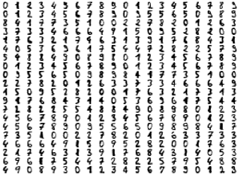
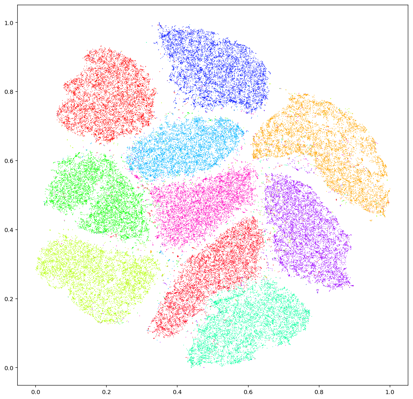
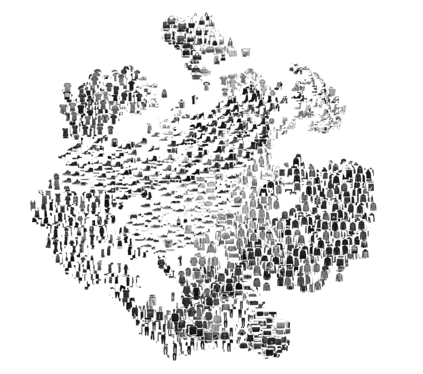
Where does t-sne (and similar) shine?
![]()
Where does t-sne (and similar) shine?
![]()
Where does t-sne (and similar) shine?
![]()